

Today let's work with the backdrop-filter property and a skewed ::before element, to create a nice shiny glass hover effect.
Read the full article or watch me code this on Youtube (TL;DW):
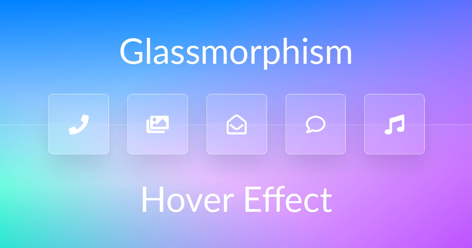
Result
First Things First - Background
Let's start with the background by overlaying three different gradients. Each gradient is running from one color to transparent and by varying the angles they blend nicely into each other.
main {
  background:
    linear-gradient(322deg,
      #ba4aff, rgba(#ba4aff, 0) 70%),
    linear-gradient(178deg,
      #008aff, rgba(#008aff, 0) 70%),
    linear-gradient(24deg,
      #00ffc6, rgba(#00ffc6, 0) 35%);
}
Markup
The markup consists of a container having a ruler producing the line in the middle and a container hosting the five icon buttons whereas each button contains an icon.
<main>
  <div class="ruler"></div>

  <div class="container">
    <a class="icon" href="#">
      <i class="fas fa-phone"></i>
    </a>
    <a class="icon" href="#">
      <i class="fas fa-images"></i>
    </a>
    <a class="icon" href="#">
      <i class="fas fa-envelope-open"></i>
    </a>
    <a class="icon" href="#">
      <i class="fas fa-comment"></i>
    </a>
    <a class="icon" href="#">
      <i class="fas fa-music"></i>
    </a>
  </div>
</main>
Basics & Ruler
Let's put a few variables, resets and center the whole thing in the viewport:
:root {
  --foreground-color: white;
}

* {
  padding: 0;
  margin: 0;
  box-sizing: border-box;
}

main {
  display: flex;
  align-items: center;
  justify-content: center;
  min-height: 100vh;
}
The ruler is going to be put in the lower half of the viewport. By setting the top border to slight white the actual ruler is produced:
.ruler {
  border-top: 1px solid rgba(white, 0.3);
  background-color: rgba(white, 0.05);

  position: absolute;
  top: 50%;
  height: 50%;
  left: 0%;
  right: 0%;
}
Setting up the container
The most important thing about the container is the grid layout configuration, which consist implicitly of one single row - as no row config is given. The columns are configured such that each of them takes the same amount of space (1fr) after the gap of 1.25rem has been taken into account.
.container {
  display: grid;
  grid-template-columns: repeat(5, 1fr);
  gap: 1.25rem;
}
Button Setup
Let's first setup some variables allowing easy customization:
- The
--sizevariable controls how large each button appears. Since it's set to6remby default, it will also respond to the documents font size. --transition-durationand--transition-easingallow us to synchronously modify both hover transitions which we'll add later.
.container {
  ...
  .icon {
    --size: 6rem;
    --transition-duration: 500ms;
    --transition-easing: ease-out;
  }
}
The icon buttons configuration itself is quite straight forward. It has a quadratic shape whereas the content is centered horizontally as well as vertically. Additionally a slight border, a strongly blurred box shadow and a translucent white for background color are added. Note that the box shadow is calculated relatively to the size of the button. So whenever the button size changed, the box-shadow is scaled along with it.
.container {
  ...
  .icon {
    // quadratic shape
    width: var(--size);
    height: var(--size);

    // center content horizontally
    // and vertically
    display: flex;
    align-items: center;
    justify-content: center;

    // apply text/font styling
    text-decoration: none;
    color: var(--foreground-color);
    font-size: 2rem;

    // Add a slight border and a
    // strongly blurred box shadow
    border: 1px solid rgba(white, 0.6);
    background-color: rgba(white, 0.1);
    border-radius: 0.5rem;
    box-shadow:
      0px
      calc(var(--size) / 6)
      calc(var(--size) / 3)
      rgba(black, 0.1);
  }
}
Glassmorphism
Now, if you came for this, this one-liner is all you need for the "classic" glassmorphism effect. This effect works best if there is a clear structure in the background which is why the ruler was added.
.container {
  ...
  .icon {
    backdrop-filter: blur(2px);
  }
}
Be aware that the
backdrop-filterproperty currently only works in webkit based browsers, so in Firefox you'll just see the translucent background, but not the blurred line of the ruler.
Shinyness
To emphasize the glassy character of each button, let's add a shiny stripe which runs from bottom left to top right every time the button is hovered. So first we ensure that the button is optically lifted up a little bit. Therefore the transform property is made transitionable and the button is lifted up by 25% of its size through the translateY transformation.
.container {
  ...
  .icon {
    transition: transform
      var(--transition-duration)
      var(--transition-easing);

    overflow: hidden;

    &:hover {
        transform: translateY(-25%);
    }
  }
}
The shiny stripe is simply created by adding a ::before pseudo-element which has a slightly stronger white as background color and is skewed by 45 degrees. Especially the skewing makes a strong contribution to the effect.
.container {
  ...
  .icon {
    overflow: hidden;

    &::before {
      content: '';
      background: rgba(white, 0.4);
      width: 60%;
      height: 100%;
      top: 0%;

      transform: skew(45deg);

      position: absolute;

      transition: left
        var(--transition-duration)
        var(--transition-easing);
    }
  }
}
Initially the shiny stripe is positioned left outside the button and shifted to the very right each time the button is hovered. And that's already it. 😎
.container {
  ...
  .icon {
    ...
      &::before {
      left: -125%;
    }

    &:hover {
      &::before {
        left: 150%;
      }
    }
  }
}