

Today let's get creative by building a morphing loading animation with icons having only 8 points and a few lines of CSS.
Read the full article or watch me code this on Youtube:
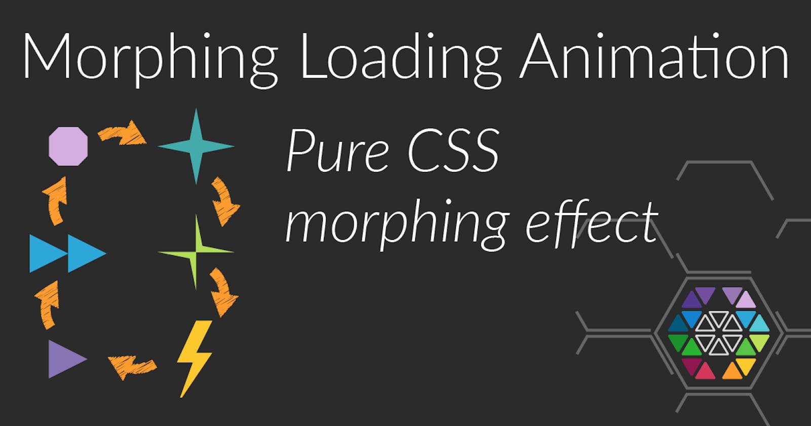
Result
Markup
This time we need almost no markup, as only a div.morph-loader is required, which is going to be shaped through a changing clip-path;
<div class="morph-loader"></div>
Basic CSS
The basic CSS code is mostly about sizing the div and giving it some color. The animation is configured to run infinitely often and has a special cubic-bezier easing function that makes the clip-path quickly transition to the next shape and then maintaining the shape for a brief moment. So its quite steep in the beginning but then flattens out.
.morph-loader {
  display: inline-block;
  width: 12rem;
  height: 12rem;
  background: white;

  animation: 4s morph cubic-bezier(0.11,0.79,0.11,0.99) infinite;
}
The animation itself
Now, for the animation itself it is simply a list of polygons whereas all polygon consist of exactly eight points. Only then the Browser can morph from one polygon to the next. Otherwise it will just "jump".
$path-octagon-small: polygon(
  37.5% 25%,
  62.5% 25%,
  75% 37.5%,
  75% 62.5%,
  62.5% 75%,
  37.5% 75%,
  25% 62.5%,
  25% 37.5%
);
$path-star: polygon(
  50% 0%,
  58% 42%,
  100% 50%,
  58% 58%,
  50% 100%,
  42% 58%,
  0% 50%,
  42% 42%
);
$path-shift-star: polygon(
  58% 42%,
  100% 50%,
  50% 50%,
  50% 100%,
  42% 58%,
  0% 50%,
  50% 50%,
  50% 0%
);
$path-thunder: polygon(
  60% 42%,
  80% 42%,
  40% 100%,
  38% 100%,
  55% 55%,
  35% 55%,
  60% 0%,
  80% 0%
);
 $path-triangle-1: polygon(
   25% 25%,
   75% 50%,
   25% 75%,
   25% 50%,
   25% 50%,
   25% 50%,
   25% 50%,
   25% 50%
 );
 $path-triangle-2: polygon(
   50% 25%,
   100% 50%,
   50% 75%,
   50% 50%,
   0% 25%,
   0% 50%,
   0% 75%,
   50% 50%
 );

$clip-paths: (
  $path-octagon-small,
  $path-star,
  $path-shift-star,
  $path-thunder,
  $path-triangle-1,
  $path-triangle-2,
  $path-octagon-small,
);
And finally, from that list, the @keyframes are generated dynamically. So first the step size is calculated and then the actual percentage is interpolated into the @keyframes rule. All that changes throughout each keyframe is simply the clip-path.
$step: 100% / (length($clip-paths) - 1);
$current: 0%;
@keyframes morph {
  @each $clip-path in $clip-paths {
    #{$current} {
      clip-path: $clip-path;
    }

    $current: $current + $step;
  }
}
Making it colorful
Since everything's greater with color, let's add some color transitions to each step. Therefore we need as many color codes as there are icons and we'll just add them to each keyframe:
$colors: (
  #d4aee0,
  #44abac,
  #b2dd57,
  #fdc82e,
  #8975b4,
  #2ca7d8,
  #d4aee0
);

$step: 100% / (length($clip-paths) - 1);
$current: 0%;
$i: 1;
@keyframes morph {
  @each $clip-path in $clip-paths {
    #{$current} {
      clip-path: $clip-path;
      background-color: nth($colors, $i);
    }

    $current: $current + $step;
    $i: $i + 1;
  }
}
And that's already it. Feel free to experiment with the shapes. If you want to create your own shapes, it's easy to use something like inkscape and a 100px x 100px canvas, so the coordinates already provide you with the correct percentages for the polygons. Also bear in mind that the order of the points is quite important, as the first point of the previous polygon is directly interpolated into the first point of the next polygon. This can create awesome effects (e.g. from star to shift-star) or make it quite messy, but this is a pure matter of experimenting. The easiest way is probably to "roll" through the points, i.e. repeatedly move the first point to the end of the list or the other way round.