

Today let's save a lot of typing by using SASS' @each and @for in combination with lists and maps in order to build an easily customizable style for a traffic light.
Read the full article or watch me code this on Youtube:
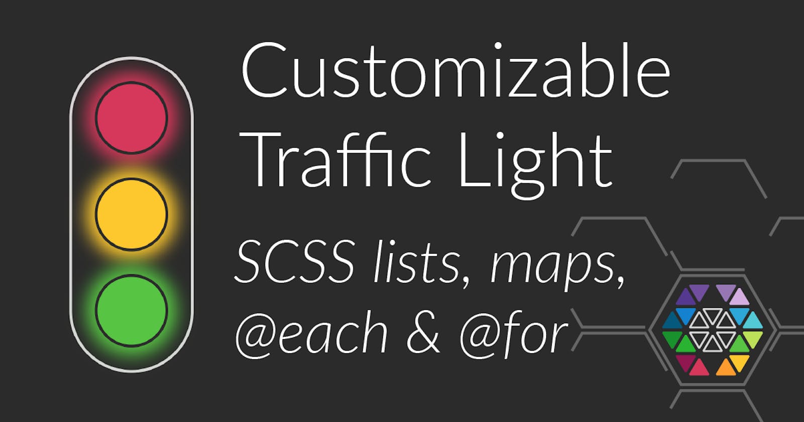
Result
Markup
The markup we're going to use is simply a wrapping div.traffic-light with - in this case - three div.lights. So, for each light that is present in the traffic light, a div.light is generated. If you need more or less lights, just adapt the lights variable.
div.traffic-light
  - const lights = 3;
  - for (let i = 0; i < lights; i++)
    div.light
Compiling the above template yields an expanded HTML looking like this:
<div class="traffic-light">
  <div class="light"></div>
  <div class="light"></div>
  <div class="light"></div>
</div>
Variable Setup
For the basic setup let's first define a few variables:
.traffic-light {
  $item-size: 3rem;
  // spacing of the wrapper
  $spacing: 8px;
  // spacing around each individual  light
  $light-spacing: 8px;
  $shine-size: 24px;
  // change traffic light from
  // vertical (column) to
  // horizontal (row)
  $direction: column;
}
The color of each light is given through an SCSS list with color codes:
.traffic-light {
  ...

  $colors: (
    #d5385a,
    #fdc82e,
    #57c443
  );
}
Basic CSS
So, for the wrapping div.traffic-light we use the flex display type to ensure that the individual div.lights are all correctly aligned in a column or a row, depending on the $direction variable and the border-radius is set to $item-size to make sure to have a half circle on the top and the bottom.
.traffic-light {
  ...
  border: 2px solid #d9d9d9;
  display: flex;
  flex-direction: $direction;
  padding: $spacing;

  $item-count: length($colors);
  border-radius: $item-size;
Now, for each individual light the dimensions are ensured through setting width and height to the specified $item-size as well as setting the border-radius to the same amount, such that each one is a perfect circle. The border is also set to 2px transparent in order to create a visual separation between the light itself and the shine which will come later through a box-shadow.
.traffic-light {
  ...

  .light {
    width: $item-size;
    height: $item-size;
    border-radius: $item-size;
    margin: $light-spacing;

    border: 2px solid transparent;
  }
}
Applying light colors
For each color given in the $colors list, an :nth-child selector is generated. The default state for a light is off, so the alpha component of each color is reduced to 10%.
.traffic-light {
  ...

  .light {
    ...

    @for $i from 1 through length($colors) {
      &:nth-child(#{$i}) {
        background-color: rgba(nth($colors, $i), 0.1);
      }
    }
  }
}
Transitioning from one light to another
To make transition from on to off and back again smooth, the transition property is setup to fade the background-color, box-shadow as well as border-color within 500 Milliseconds to their new values.
.traffic-light {
  ...

  .light {
    transition: 500ms background-color ease, 500ms box-shadow ease, border-color 500ms ease;
  }
}
And now it gets a little bit more tricky. A traffic light can have states, where e.g. red and yellow or green and yellow light at the same time. To make the sequence of states customizable, a map called $states is used. The keys of the map represent the name of each state, so you're not bound to numeric values here. And the value of each key is the 1-based index of the :nth-child selector for each light that is to be turned on in the respective state.
.traffic-light {
  ...
  $states: (
    1: (1), // red
    2: (1, 2), // red, yellow
    3: (3), // green
    4: (2, 3), // yellow, green
    5: (1), // red
  );
And to save a lot of typing work, from that map all the necessary selectors and property can be generated to make everything work. So for each state name a new selector .light.state-<state name> is generated which selects the nth children given in the state sequence and applies the full color together with a box-shadow to make the light actually shine.
So the good part is, with this at hand, only the state sequence needs to be given and the resulting CSS code is generated upon compilation.
And that's already everything you need, to create and customize this nice little traffic light. Feel free to experiment with the pen given at the beginning at the article and let me know what you think.
.traffic-light {
  ...

  .light {
    @each $state, $sequence in $states {
      &.state-#{$state} {
        @each $i in $sequence {
          > :nth-child(#{$i}) {
            background-color: nth($colors, $i);
            box-shadow: 0px 0px 0.5 * $shine-size 0.25 * $shine-size nth($colors, $i);
            border-color: #2b2b2b;
          }
        }
      }
    }
  }
}